Choosing the Right Colors
Choosing colors for a quilt can feel both thrilling and overwhelming. A task that initially was thrilling can quickly become burdensome and overwhelming. However, that doesn’t always have to be the case. Creating a pleasing color palette is a mix of artistic instinct, personal taste, and a little bit of color theory.
Whether you’re standing in a quilt shop surrounded by bolts of fabric or scrolling through online swatches late at night, the question is the same: How do you know what will actually look good together?
The truth is you don’t need formal art training to create beautiful color combinations. However, there are a few simple principles you can easily follow. Add to that a willingness to play any quilter — beginner or seasoned — can build a palette that feels cohesive, expressive, and uniquely their own. Think of this as an invitation to explore, experiment, and trust your eye a little more each time.
Why Color Matters
Color is the emotional heartbeat of a quilt. It sets the tone before a single stitch is sewn — bright and joyful, soft and nostalgic, bold and modern, or calm and earthy. In fact, the colors you choose tell a story, even if you don’t realize it at first. And for beginners especially, learning to see color with curiosity rather than fear is one of the most empowering steps in the quilting journey. Color confidence isn’t something you’re born with; it’s something you build, one palette at a time.
Understanding the Basics of Color
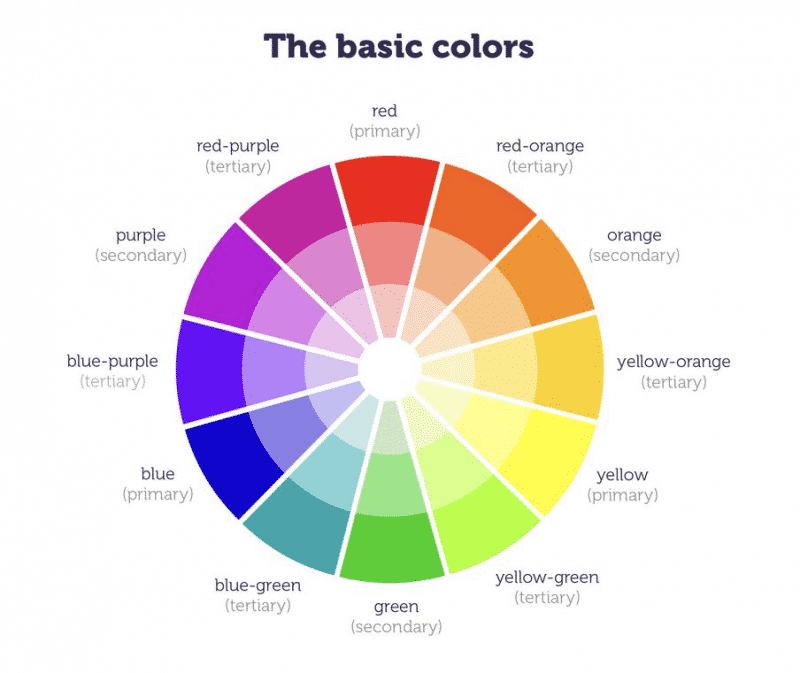
The Color Wheel (A Gentle Introduction)
You don’t need to memorize the color wheel, but understanding its broad strokes helps you make intentional choices.
My earliest recollection of learning color theory was as a young girl, sitting outside on my picnic table with tubs of finger paint, sheets of paper and a cup of water. After brushing water on the paper, I would spend hours spreading the brightly colored pigments across the paper. Those afternoons spent mixing and blending colors was the beginning of my love for color. As a result of these early “color theory” experiments – to physically mix colors like red and blue to create an entirely different color – green- was as magical as it was empowering.
Primary colors (red, yellow, blue) mix to create secondary colors (orange, green, purple), and those blend into tertiary colors. Warm colors tend to feel energetic and cozy; cool colors feel calm and refreshing. Knowing where colors sit in relation to each other gives you a simple roadmap for harmony.
Moving past the basics – primary, secondary and tertiary are the more complex color families: the shades, tints and tones. The addition of these colors into the mix is where, in my personal opinion, color selection becomes complicated.
Adding black to a pure red results in a deeper, darker red.
Adding grey to the same hue gives a muted effect and adding white results in a bright red.
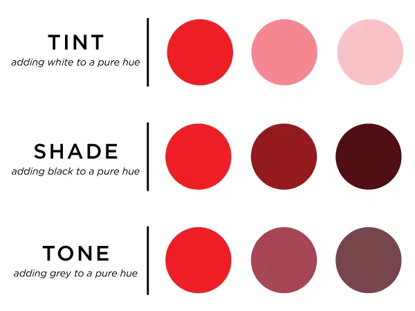
The idea isn’t so much about choosing the “right” or “wrong” colors but what is the effect you are wanting to achieve. You’ll be surprised at how well your own eye can discern what color or color combination “works” and what does not and this comes with practice.
Until you gain confidence in color selection, a color wheel is a great place to start.
Value: The Secret Ingredient
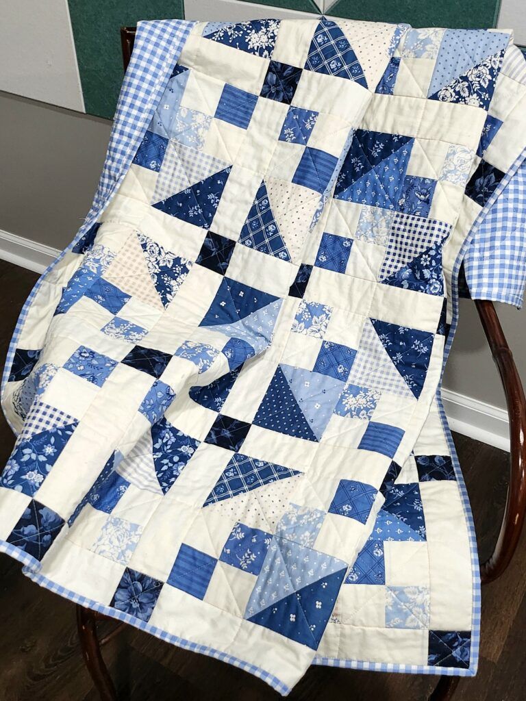
I’ve been auditioning various fabric combinations for an upcoming sew-along. Initially, I felt going with shades of blue and white would be the way to go. It’s an easy palette to create but the small size of the panel didn’t create enough visual interest.
Swinging the pendulum in the opposite direction, I chose fabrics of similar value and color. The result was even worse. High value against white creates too much contrast. Alternatively, the medium value fabrics against the white is too little. As you can see in the images below comparing the color with black and white images, the value differences are loud and clear.
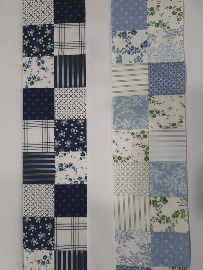
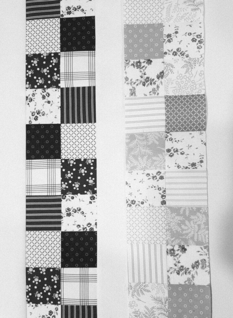
If there’s one concept that transforms a quilt, it’s value — the lightness or darkness of a color. A palette with all low/medium-value fabrics can look flat, even if the colors are gorgeous.
Mixing lights, mediums, and darks creates depth, movement, and sparkle.
I believe in my third attempt, I was able to achieve this:
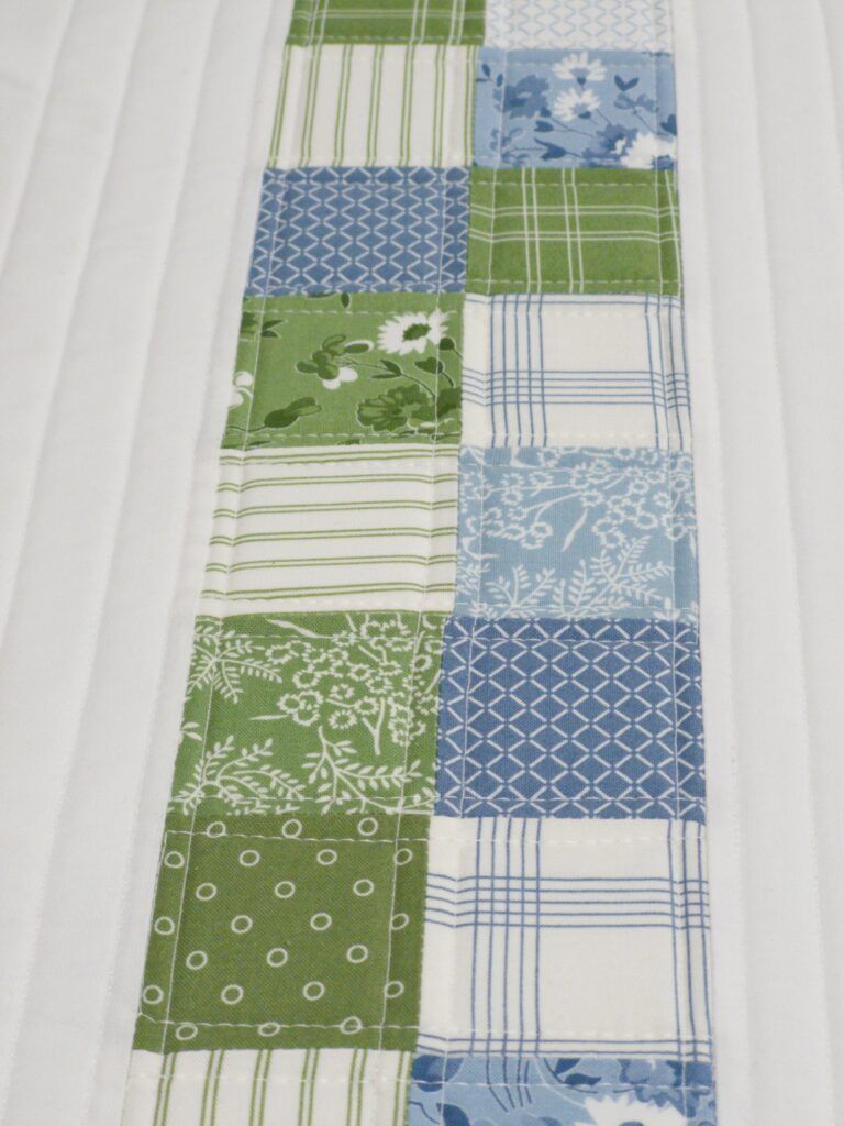
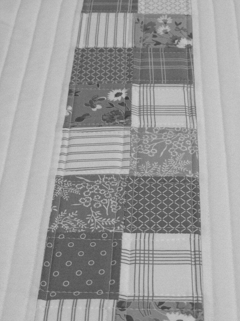
Saturation: Bright, Muted, and Everything Between
Saturation refers to how intense a color is. Highly saturated colors feel bold and modern; muted colors feel soft and vintage. A palette with a mix of saturations can feel lively and balanced, while sticking to one saturation level creates a very specific mood.
Simple Color Strategies for Beginners
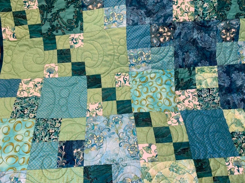
Monochromatic Palettes
Working within one color family — all blues, all greens, all pinks — is a wonderfully forgiving way to start. Let value do the heavy lifting, and you’ll be surprised how dynamic a “single-color” quilt. The quilt I made last year (shown below) is just one example of how using the same color but in various degrees of value and saturation can be as interesting as a quilt using every color on a wheel.
Complementary Color Schemes
These are colors opposite each other on the wheel, like blue and orange or purple and yellow. Pink and green is another popular color schemes and one of my favorites. They create bold, energetic contrast. The trick is balance: let one color lead and the other support.
Analogous Color Schemes
These are neighbors on the color wheel — think teal, blue, and green. They blend beautifully and create a calm, cohesive look. This is a great choice for quilts meant to soothe or relax.
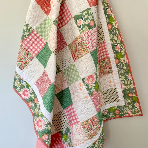
Neutrals as Anchors
Neutrals give the eye a place to rest. Whether you love crisp white, warm cream, soft gray, or dramatic black, neutrals help your colors shine without overwhelming the design.
The quilt shown below was made by Suzy Quilts. Take a look here and throughout her site for LOTS of Quilty inspiration!
Finding Inspiration for Your Palette
Color inspiration is everywhere once you start looking.
- A sunset with peach, lavender, and deep navy
- A favorite scarf or dress
- A photograph you love
- A curated fabric bundle
- A stack of fall leaves or a spring bouquet
Let yourself respond emotionally. If something makes you pause and think, I love those colors, that’s a palette worth exploring.
Practical Tools and Techniques
Use a Color Wheel or App
There are wonderful beginner-friendly tools that suggest combinations based on simple rules. They’re great for building confidence.
Pull Fabrics in Person When You Can
Lay fabrics side by side. Step back. Squint. Rearrange. This tactile play is where the magic happens. And don’t forget the black‑and‑white photo trick for checking value.
Start With a Print You Love
This is one of the easiest ways to build a palette. Choose a print that makes your heart skip a beat, then pull supporting colors from its details. The print becomes your guide.
Make a Test Block
A single block can reveal so much — whether your values are balanced, whether a color feels too loud or too quiet, whether the palette feels like you. It’s a low‑pressure way to adjust before committing.
*A New Discovery* – the Palette Scout for Quilters by Zollie. I have not had an opportunity to use this system, but it does look intriguing. It consists of a collection of cards that you use as a color wheel to make your color choices. Next, you take your cards with you to pull fabric from your stash (or take with to a fabric store). This appears to be a solid method for making fabric choices that saves time and frustration. Someone is always coming up with a better mouse trap!
Common Color Mistakes (and How to Avoid Them)
- Too many medium-value fabrics: Add lights and darks for contrast.
- Overusing busy prints: Mix in solids or subtle textures.
- Chasing trends: Choose colors you genuinely love, not just what’s popular.
- Ignoring contrast: Even the prettiest colors need variation to shine.
These aren’t failures — they’re learning moments every quilter goes through. I’ve made every one of those mistakes. Ignoring contrasts would need to be at the top of my list of mistakes but with each fabric pull, I’m learning something new.
Building Your Color Confidence
Color confidence grows with practice, not perfection. Keep a small color journal or swatch book. Save photos of palettes that inspire you. Try small projects like potholders or mini quilts to test ideas. Over time, you’ll start to recognize the palettes that feel like home.
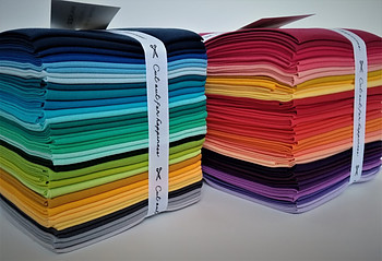
Purchasing fabric bundles – like fat quarters, fat eighth’s, charm packs, etc. is an excellent way to get your feet wet in the world of fabric. Each piece of fabric in a bundle is created using a coordinated color palette so it’s basically fool-proof.
Your Quilt, Your Voice
At the end of the day, choosing colors is an act of self-expression. There’s no “right” answer — only what feels right to you. Trust your instincts, stay curious, and let yourself enjoy the process.
I can’t stress that enough. It’s your quilt and an expression of your artistic voice.
Every quilt you make teaches you something new about color and creativity. And in this process, as your perspective widens to see possibilities, the fear of making a wrong choice becomes less and less.